
Clutch.Win aimed to provide the pure enjoyment of video games to users through short video clips.
Clutch.Win was an early stage, scrappy startup that continued to improve the MVP. Unfortunately, due to a lack of funding and COVID-19 outbreak in 2020, the company shut down.


Overview:
After the continued efforts to improve the development of the mobile app, the commitment to emphasize a growth in user base on the web platform was born.
The nature of gaming is that it’s always evolving. The user base, content, game styles, etc.
To cater to these trends we needed to translate the experience we’d built on the app to web. But how does a team do that?
This project is called the “Clutch Web Redesign”. This project is split up into two initiatives: Home page & Post details page.

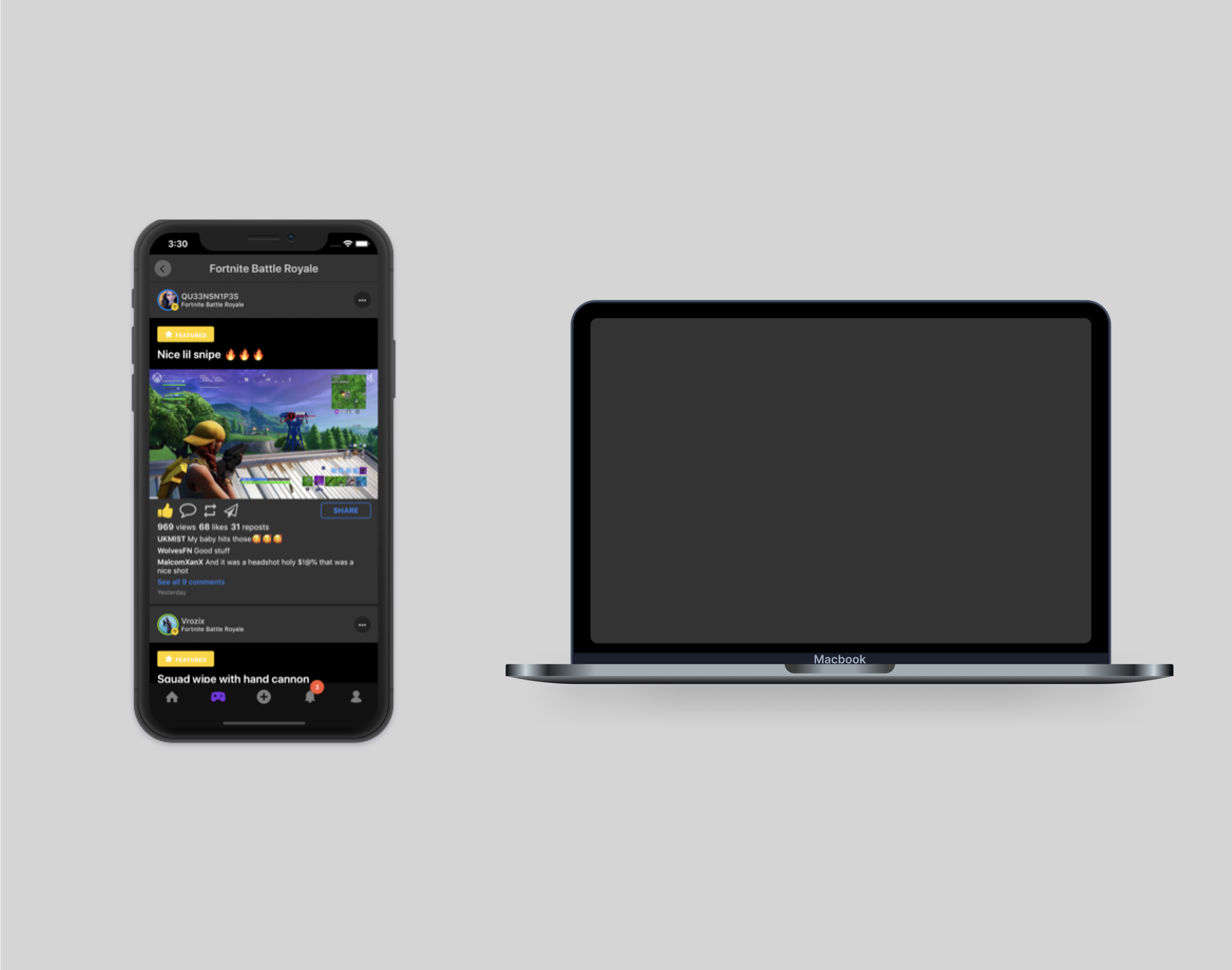
Previous UI
Problem
The web platform of Clutch lacked structure. The nature of being a mobile first product allowed us to get by with a scaled up UI of the mobile app on web. With the rise in PC gamers, we wanted to create an experience that we would be proud to introduce to users.
Create an experience that drove exploration and a sense of community.
Challenge
There were a few key areas we wanted to focus on while we worked through this project.

What creates a community?
How do we promote a healthy and inclusive community?

What’s the value proposition?
Why would a user want to use this? What’s in it for each type of user?
How do we incorporate the app’s design system?
How can we make web feel like mobile while taking advantage of web capabilities?
User Goal
The user goal was to ensure that users had the capabilities to showcase their video game clips via the web platform. We want to create an avenue of entertainment that users look forward to scrolling through while maintaining a simplicity that doesn’t obstruct the user flow.
Business Goal
The business goal was to increase the user base that used the web platform of Clutch. With the rise in user base of desktop gamers, we needed to balance the effort in app and web platforms.
Research
User Surveys
By sending out a survey to our user base we were able to achieve an understanding of how users felt about the current web platform and how it could improved.
User Interviews
By taking advantage of our brand ambassador program, we were able to speak directly to users who knew the full capabilities of our platform along with how they used competitor products.
User Task Flow
By mapping out the user task flow from a mobile and web perspective, we had a great understanding of what areas needed to be redefined and how that would help the overall architecture of our product.
Strategy:
Emphasize content driven UX.
Provide a variety of avenues for exploration throughout each page while keeping the layout and UI in line with the design system. From the moment the user lands on the home page, to when they engage with an individual post, provide as many exploratory options to promote the flow and stream of content.

Early Exploration & Sketches:
After going through the initial sketches we quickly recognized the framework we would implement in the homepage could and should be implemented into the subsequent screens as well. This not only drives the consistency of the product but helps establish our design system more efficiently.
This visualization represents the ability of our web and app platforms to be rooted back to a foundational design system. Creating an experience that feels connected had always been a priority and would improve retention across both platforms.

Rough sketches. The nature of being a smaller team is having the ability to collaborate on a smaller scale. This turned into a philosophy that was instilled in the culture at Clutch.Win - and eventually into myself as a designer. The concept of getting ideas on paper as soon as possible. Regardless of how rough sketches or ideas looked, being able to showcase a visual is much more efficient than communicating through words and text.

Understanding what areas could be potential bottlenecks to the user experience and learning how to visualize that through a user task flow was crucial in the progression of this project. (Link to open up Figma file of User Task Flow)

Solution
Because the previous user base on the web platform was slim to none, there was not a sufficient amount of data to make decisions off of. As often as we could, we leveraged mobile data points to drive the web platform decisions.
Focusing in on engagement metrics.
Saw a negative trend of users’ time spent on the home feed of the mobile platform.
Bounce rates were increasing (Users clicking on a specific piece of content but exiting out of the app without continuing to the next post.)
Users not spending as much time on suggested content.
Not posting content.
Ultimately, to put an emphasis on driving targeted content, we decided it was best to design the post details page to provide different avenues of exploration from other users; instead of providing more content from the original poster.
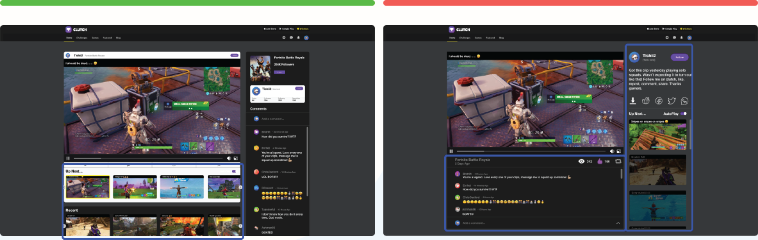
Final Screens

Home Page

Home Page Menu

Post Details Page

Design System Component Additions
Impact
Shortly after launching, we quickly saw adoption increase. Users started posting more, engaging with more likes and comments, and staying on Clutch for longer durations. Unfortunately, shortly following this release, Clutch.Win shut down.
There will always be aspects of this flow that could’ve been improved. The connection between the post and the user’s community is one area I would’ve loved to iterate on.