
Clutch.Win aimed to provide the pure enjoyment of video games to users through short video clips.
Clutch.Win was an early stage, scrappy startup that continued to improve the MVP. Unfortunately, due to a lack of funding and COVID-19 outbreak in 2020, the company shut down.

Overview:
The web uploader is the most vital feature within Clutch.
It allows users to upload, edit, caption and post their content to provide a consistent stream to the product. With the update in structure to the web platform and an agile development process in mind, the need to provide an experience that is easy to navigate and values only the necessary tools (for this iteration) was set in motion.
Problem
How do we create a user task flow that streamlines the intricacies of uploading new content and guides the user through each step of the process? All while maintaining the simplicity necessary for user adoption in a brand new feature?
Challenge
There were a few key areas we wanted to focus on while we worked through this project.

What’s necessary in the first iteration?
Part of the battle with a completely new feature is to keeping it simple enough for user adoption. How is that achieved?

Information Architecture
When a user begins the uploading process, what should be the first step? How do we make that clear? The second step? Third?

Create a scalable feature.
Understand that this is the first of many iterations. Include what’s necessary for a user to complete the task. Focus on advanced features after that.
User Goal
The user goal is to easily understand and complete the task of uploading a video clip from the user’s computer. The north star goal is for a user to be able to use this uploader feature to do any and all manipulations on their video clip necessary.
Business Goal
The business goal was to continue driving the flow of content throughout the product. As we’re able to supply users with new, unique video clips, the more our retention metrics would stick and user base grows.

Research
Component Breakdown
The component breakdown allowed us to grasp a better understanding of the steps that go into the Web Uploader. By analyzing even just the first page within the process, we were able to prioritize and create a mental model of the visual hierarchy that needed to be implemented.

Prioritization Martix
After thoroughly understanding what each section of the web uploader does, we took part in a prioritization matrix workshop. This allowed us to understand the relative importance of a set of items based on two weighted criteria - value to the user and feasibility by the Clutch team.
A heart represents a “Must Have” feature.
A thumbs up represents a “Nice to Have” Feature.

Prioritization Matrix Outcome
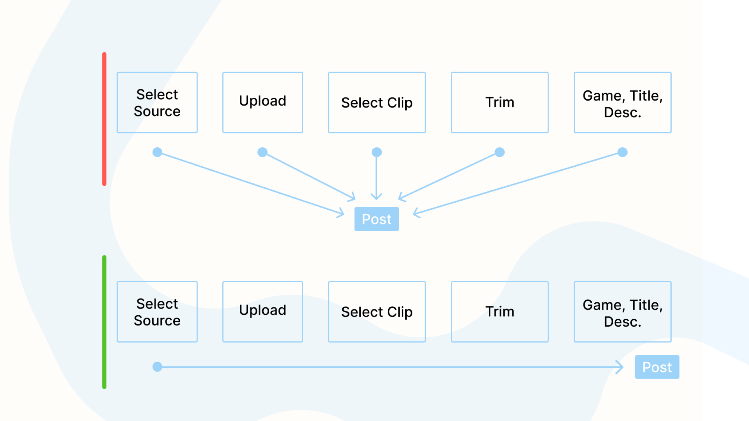
After analyzing the matrix, we concluded that the reason so many users were confused and unsatisfied with the previous web uploader UI was because there was no clear first step.
By implementing a Linear Flow to the tasks of the feature, we’re able to not only create a streamlined process for users, but also teach the user how to use the feature as well.
Strategy:
Emphasize content driven UX. Provide a variety of avenues for exploration throughout each page while keeping the layout and UI in line with the design system. From the moment the user lands on the home page, to engaging with an individual post, provide as many exploratory options to promote the flow and consistency of content.
Wireframing
The framework becomes much clearer reating wireframes and being able to visualize the research we’d accumulated. Wireframes were crucial in creating the visual hierarchy for the user to follow.

Wireframe 1 - Choose Clip

Wireframe 2 - Edit

Wireframe 3 - Create Post
Solution
Visual Hierarchy
Understanding the importance within each piece of information and iterating off each minimum viable product played a key role in keeping the UI as simple and transparent as possible. Knowing how and when to alter the framework helped in maximizing the visual hierarchy.
Part of the way we emphasize visual hierarchy is by starting any user wanting to upload new content with a default empty state. This creates a mental cue for the user to select a source.
Working in Agile - Iterations
Part of the project was to streamline the process from start to finish. Understanding this was only the first iteration of many to come, we began by only implementing the trim tool in the edit phase.
This decision was backed by analyzing the most commonly used tool within the mobile uploader - which was far and wide the trim tool.
Creating a Scalable Product
By requiring users to input the game their clip was taken from allows the Clutch.Win platform to scale and provide a means of categorization for all content.
Final Screens

Choose Clip - Empty State

Choose Clip

Edit - Trim
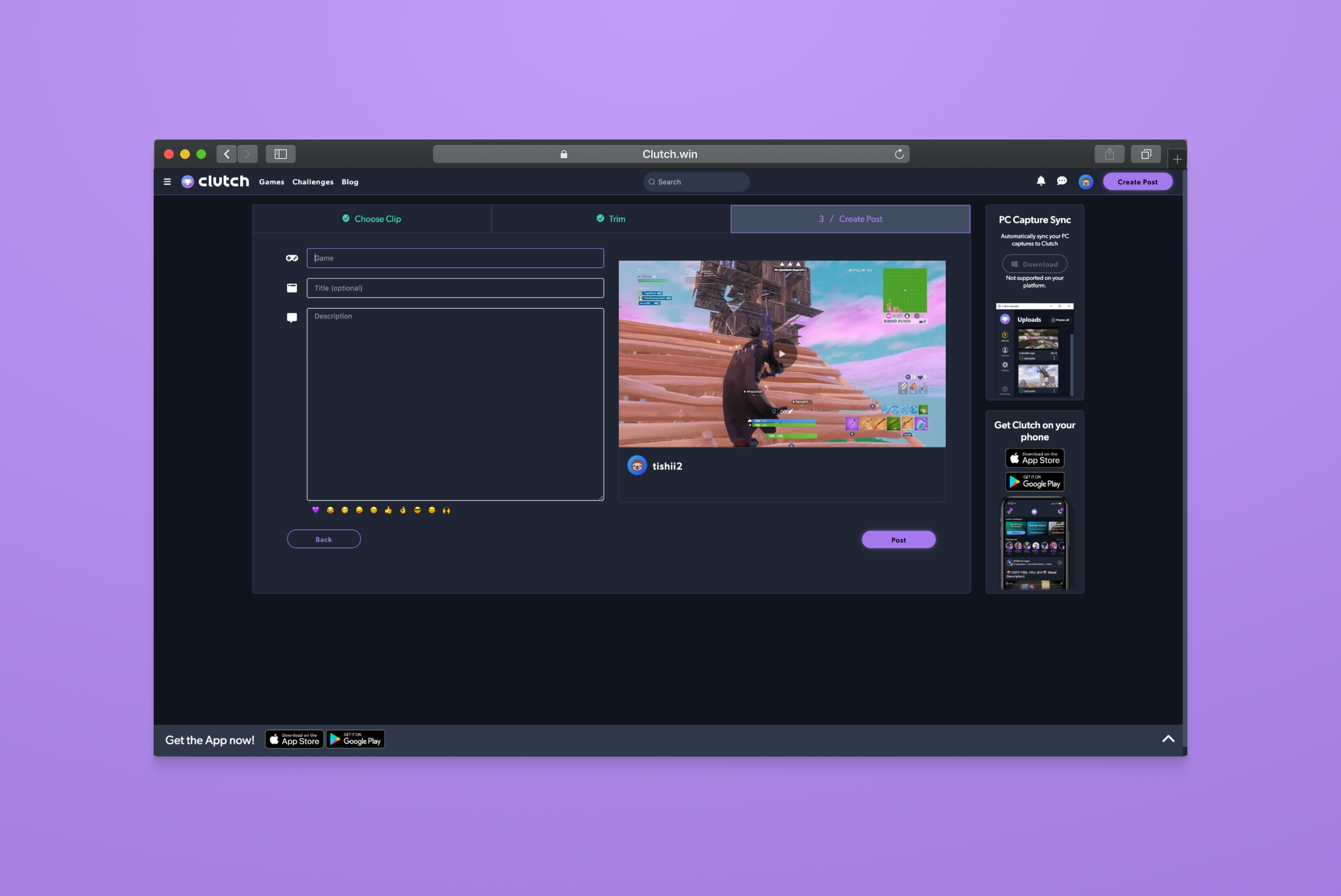
Create Post - Game, Title, Description
Learnings
Working in agile, design is never finished. Would love to have focused on more editing tools - color filters, voice overs, zoom effects, etc.
Solutions come from solving information architecture.